Git Live
About a month ago, GitHub announced the start of their third annual data
challenge. With access to a huge amount of public GitHub
data, including historical data accessible on Google BigQuery and also
available for download, there were tons of possibilities for cool projects. My
project, Git Live, was available at www.gitlive.net (now
retired).
Back when the challenge was announced, looking at past projects, there were all kinds of interesting findings related to programming languages, analyses of individuals’ open-source contributions, and aggregate statistics for users, repositories, or GitHub as a whole. I particuarly enjoyed reading this post about emotions in commit messages. The project I had in mind for the GitHub data challenge was pretty different from what has been done in the past.
Motivation
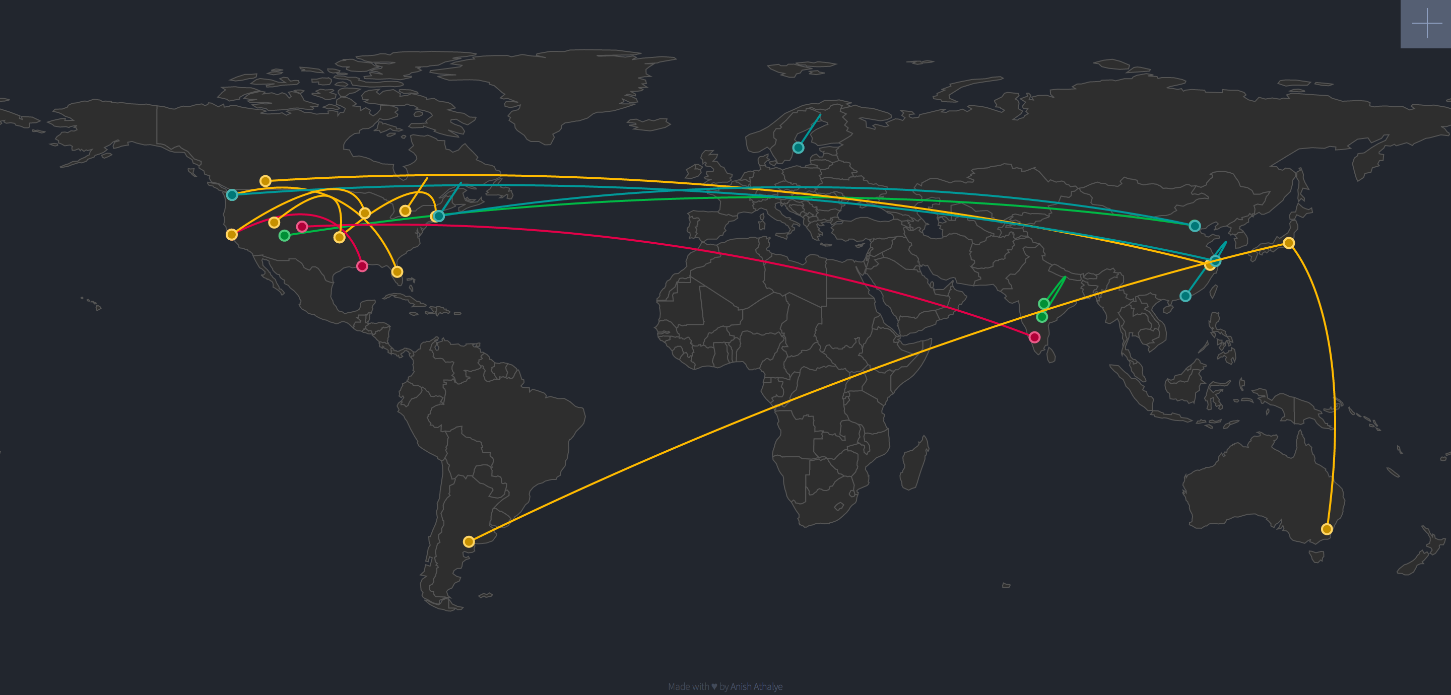
One of the coolest things about GitHub is that it’s bringing together people from all over the world to build awesome things together. It’s not that this wasn’t possible before, but GitHub does such a great job at lowering barriers to collaboration. GitHub has a huge impact on social coding, so I wanted to build a visualization to showcase the collaborative aspect of coding. I wanted to see how people from all over the world are interacting with each other, influencing each other, and spreading knowledge and ideas.
Also, I wanted to do all this in real-time. To my knowledge, this has not been done before.
Infrastructure
GitHub provides access to real-time public timeline data via their events API. Git Live uses a Scala application to turn the GitHub API into an event stream, doing some processing and filtering and then pushing the data into a RabbitMQ event queue. On a web server, the data is read by a Node.js app, and it’s pushed to the browser in real-time using HTML5 server-sent events. In the browser, the information is displayed and animated using D3.js.
Insights
It’s pretty fun to just sit and stare at the animation (hmm, maybe I should figure out how to turn it into a screensaver or something…). The visualization can also help us better understand how people are influencing each other and collaborating on GitHub.
I was surprised by the amount of overseas collaboration I saw in the visualization. I was expecting to see a bias toward people collaborating with others physically close to them, but that doesn’t seem to be the case.
It’s also pretty cool to look at the direction in which information flows. It looks like the majority of innovation on GitHub is happening in the United States and Europe, and there are a lot of people in other parts of the world who are maily doing things like starring others’ repositories. Maybe this imbalance will change in the future.
Looking at specific locations at different times of the day, there is a definite increase in activity during daylight hours, but in general, there is some level of activity throughout the day and night in almost every region.
Global collaboration (and overall activity) is dominated by North America, Europe, and Asia, but there is usually some activity in South America, Australia, and Africa too. I haven’t noticed much activity from Antarctica, at least not yet.
Evolution
For your amusement, here are some screenshots taken during the development process. There’s a pretty stark contrast between the current design and the initial implementations.
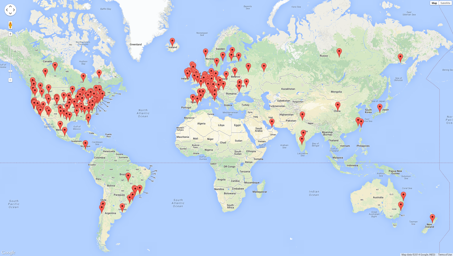
The first iteration looked something like this:
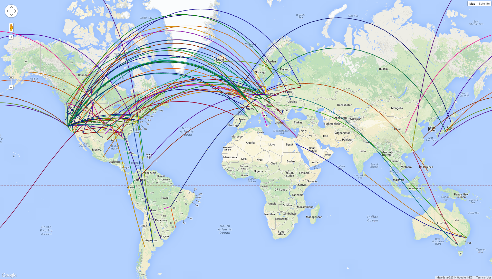
Adding arcs between collaborators instead of just showing their locations as points:
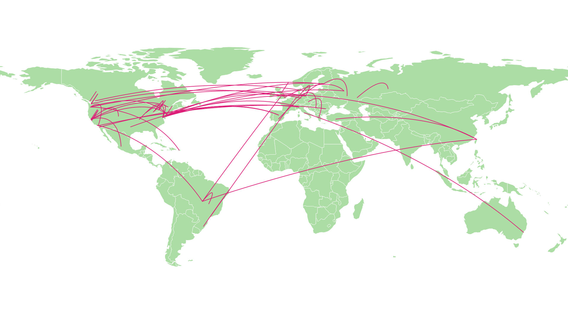
Switching to D3.js:
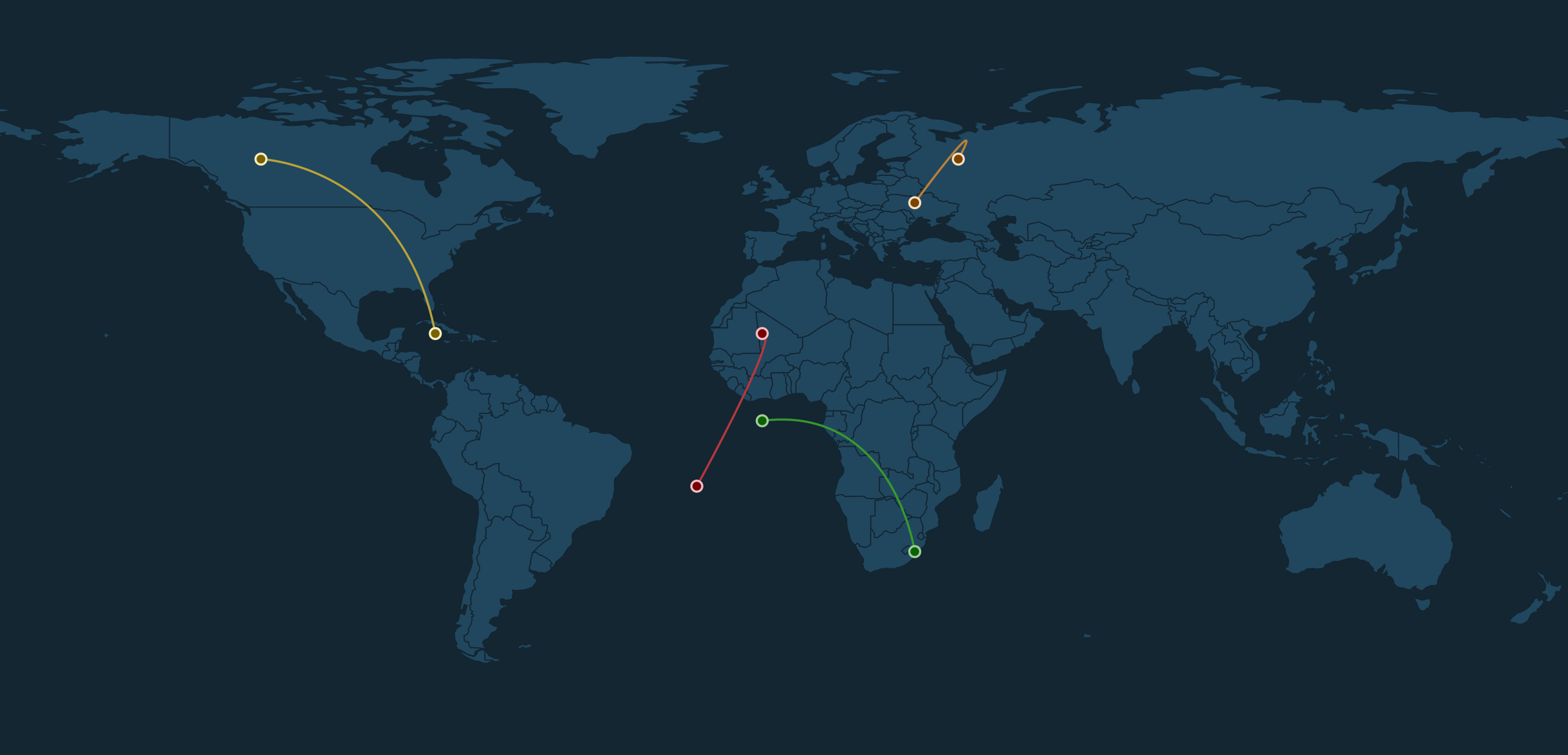
Trying out another style:
Iterating again on the style and adding an info button:
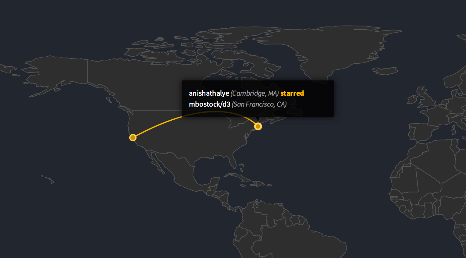
Adding tooltips:
The final result is no longer online, but source code is available for those who want to experiment with it.